Radio
Radio form components should be used when presenting a list of options from which one should be chosen.

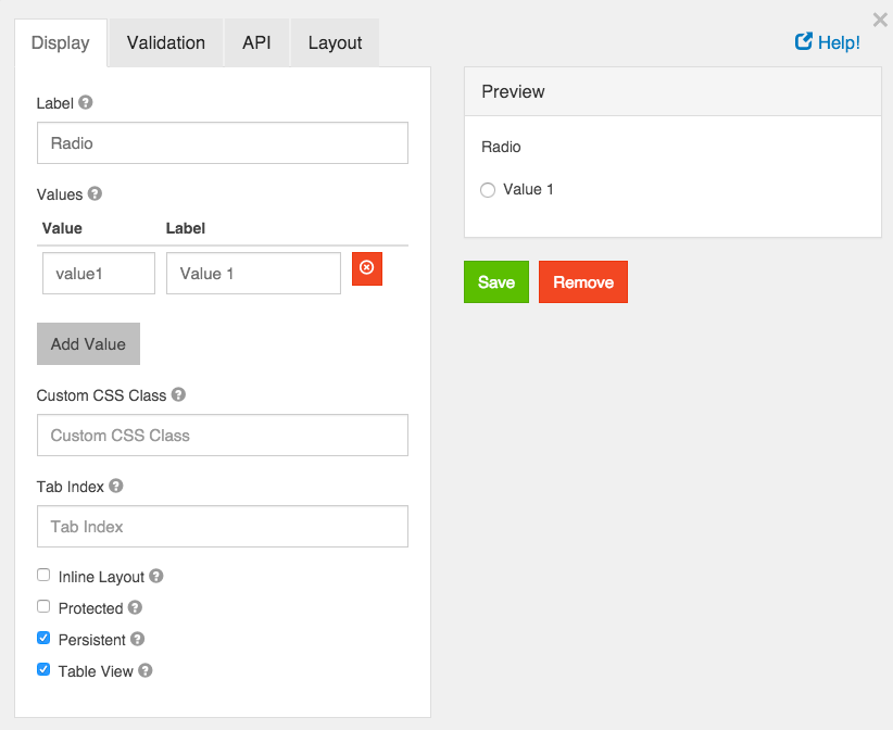
Label
The label for this field that will appear next to it.
Values
These are the values that will be selected on this field. The Value column is what will be stored in the database and the Label is what is shown to the users.
Custom CSS Class
A custom CSS class to add to this component. You may add multiple class names separated by a space.
Tab Index
Sets the tabindex attribute of this component to override the tab order of the form. See the MDN documentation on tabindex for more information on how it works.
Inline Layout
If checked, this field will layout the radio buttons horizontally instead of vertically.
Protected
If checked, this field is for input only. When being queried by the API it will not appear in the properties and also should not appear in exported data. You won’t be able to see the value on form.io, but it will be stored in database under the hood.
Persistent
If checked, the field will be stored in the database. If you want a field to not save, uncheck this box. This is useful for fields like password validation that shouldn’t save.
Table View
If checked, this value will show up in the table view of the submissions list.

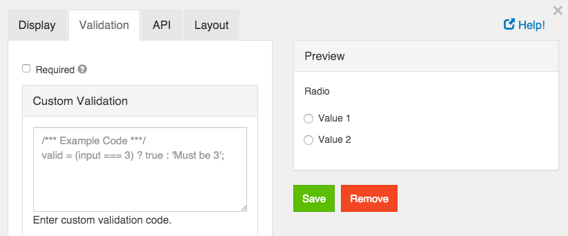
Required
If checked, the field will be required to have a value.
Custom Validation
You can use javascript to perform validation on a field. The way to respond is by setting the valid variable. If it is set to true then the validation passes. If you set it to a string, the validation fails and the validation message is set to whatever the valid variable is set to.
In addition, input variable is set to the value that has been entered in the field. The component variable is set to the definition of the field.
You can also reference other resources and properties for validation. For example, if there is a user resource with a password field, you can use its value with user.password