Date / Time
Date/Time form components can be used to input dates, times or both dates and times.

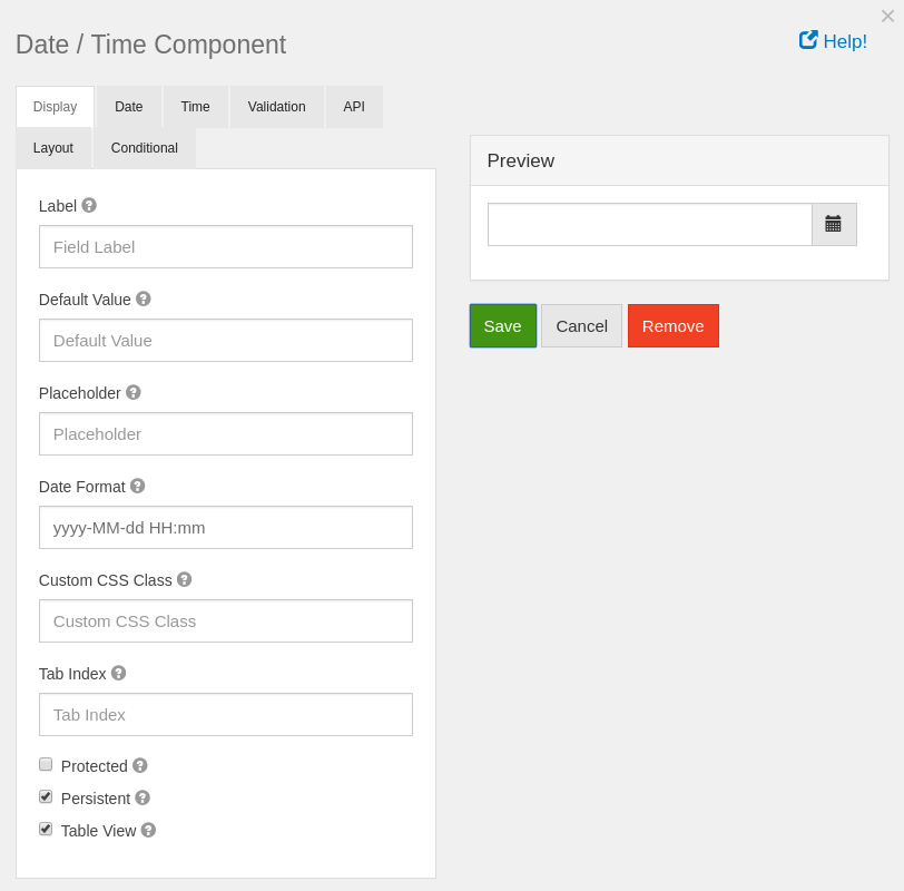
Label
The label for this field that will appear next to it.
Default value
The default value for the date component. You can put new Date(); for the current date or use a few of Moment.js functions to set the date to a specific date. For example: moment().add(50, 'days').calendar(); You can use the add or subtract function to go forward or backwards in dates.
Placeholder
The placeholder text that will appear when this field is empty.
Date Format
The format for displaying this field’s date. The format must be specified like the AngularJS date filter.
Custom CSS Class
A custom CSS class to add to this component. You may add multiple class names separated by a space.
Tab Index
Sets the tabindex attribute of this component to override the tab order of the form. See the MDN documentation on tabindex for more information on how it works.
Protected
If checked, this field is for input only. When being queried by the API it will not appear in the properties and also should not appear in exported data. You won’t be able to see the value on form.io, but it will be stored in database under the hood.
Persistent
If checked, the field will be stored in the database. If you want a field to not save, uncheck this box. This is useful for fields like password validation that shouldn’t save.
Table View
If checked, this value will show up in the table view of the submissions list.

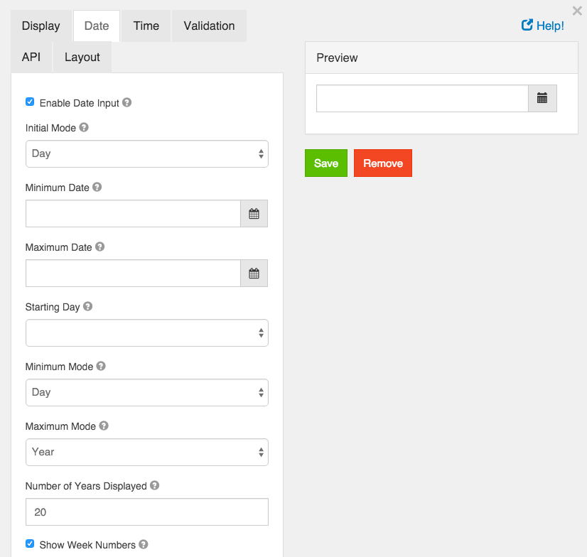
Enable Date Input
If this is checked, dates can be entered for this field.
Initial Mode
When the date picker appears, this sets the initial view of the picker.
Minimum Date
A value of the date that this field’s value must be after.
Maximum Date
A value of the date that this field’s value must be before.
Starting Day
On the calendar, select the day of the week that should start the week. In Europe this is typically Monday and in the US this is typically Sunday.
Minimum Mode
Limit the datepicker modes to a minimum of this value.
Maximum Mode
Limit the datepicker modes to a maximum of this value.
Maximum Years Displayed
The maximum number of years to display in the datepicker.
Show Week Numbers
If this is checked, when in Day mode, the datepicker will display the week number on the left hand side of the datepicker.

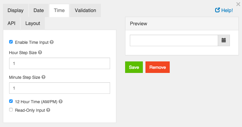
Enable Time Input
Allow entering a time as part of this field.
Hour Step Size
The number of hours to increment/decrement in the time picker.
Minute Step Size
The number of minutes to increment/decrement in the time picker.
12 Hour Time (AM/PM)
If checked, time will be displayed in 12 hour (am/pm) time. If not checked, it will appear in 24 hour time.
Read Only Input
If checked, users cannot directly enter a time. They can only use the increment/decrement controls to change the time. If unchecked, users can directly enter time values.

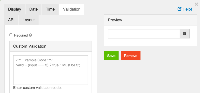
Required
If checked, the field will be required to have a value.
Custom Validation
You can use javascript to perform validation on a field. The way to respond is by setting the valid variable. If it is set to true then the validation passes. If you set it to a string, the validation fails and the validation message is set to whatever the valid variable is set to.
In addition, input variable is set to the value that has been entered in the field. The component variable is set to the definition of the field.
You can also reference other resources and properties for validation. For example, if there is a user resource with a password field, you can use its value with user.password